
In the dynamic realm of graphic design, icons serve as powerful visual cues, communicating information swiftly and succinctly. Among these icons, the humble tick mark, symbolizing correctness or completion, has undergone a fascinating evolution from its analog origins to its digital iterations today. This transition mirrors broader shifts in technology, culture, and design aesthetics. Let’s embark on a journey tracing the metamorphosis of tick icon, from their inception to their contemporary digital forms.
1. The Analog Era:
In the analog world, ticks found their earliest expression in handwritten checkmarks or ✓ symbols. These simple yet effective marks were manually drawn to denote completion or approval on paper documents, such as to-do lists or exam papers. Their versatility and universality made them indispensable tools for conveying affirmative actions in various contexts.
2. The Print Revolution:
![]()
With the advent of printing technology, tick icons began to appear in typographic form. Print media, including newspapers, magazines, and books, adopted standardized tick symbols for tasks like marking correct answers in quizzes or indicating completed items in lists. These typographic ticks, often rendered as small, uniform checkmarks, provided clarity and consistency in printed communication.
3. The Rise of Digital Design:
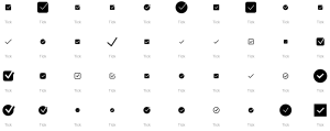
The proliferation of computers and digital interfaces ushered in a new era for tick icons. Graphic designers embraced vector graphics and digital software to create sleek, scalable representations of ticks. Early digital tick icons retained the familiar checkmark shape but introduced variations in style, line thickness, and curvature. These icons adorned user interfaces, software applications, and websites, enhancing user experience and visual appeal.
4. Minimalism and Flat Design:
As design trends evolved, minimalist and flat design principles gained prominence, influencing the aesthetics of tick icons. Designers stripped away embellishments, opting for clean lines and simplified forms. Tick icons became flatter, with sharp angles and minimal detail, aligning with the overall visual language of contemporary digital design. This minimalist approach prioritized clarity and readability, ensuring that tick icons remained instantly recognizable across diverse platforms and devices.
5. Dynamic and Interactive Tick Icons:
With the rise of interactive digital experiences, tick icons have become more dynamic and engaging. Animated ticks, pulsating with life, provide visual feedback to users, signaling successful actions or completed tasks. These interactive elements add depth and interactivity to user interfaces, enhancing usability and user engagement. Whether it’s a subtle hover effect or a playful animation, dynamic tick icons inject personality and vitality into digital interactions.
6. The Age of Customization:
In today’s design landscape, customization reigns supreme. Graphic designers have the freedom to craft tick icons that align with brand identities and design aesthetics. From geometric abstractions to whimsical illustrations, tick icons come in myriad forms, reflecting the diversity of visual languages in contemporary design. Customized tick icons infuse personality and authenticity into digital experiences, fostering brand recognition and emotional connection with users.
7. Accessibility and Inclusivity:
As design evolves, so too does the emphasis on accessibility and inclusivity. Designers strive to create tick icons that are universally understood and accessible to all users, regardless of their backgrounds or abilities. Clear, high-contrast designs ensure legibility for individuals with visual impairments, while intuitive animations and interactions cater to diverse user needs. By prioritizing accessibility, designers uphold the principle that good design should be inclusive and equitable for all.
8. The Future of Tick Icons:
Looking ahead, the evolution of tick icons shows no signs of slowing down. Advancements in technology, such as augmented reality and immersive interfaces, present new opportunities for innovation in graphic design. Tick icons may evolve to adapt to these emerging technologies, seamlessly integrating into immersive digital environments while retaining their core function of conveying information effectively.
In conclusion, the evolution of tick icons from analog to digital reflects broader shifts in technology, culture, and design aesthetics. From handwritten symbols to dynamic digital animations, tick icons have adapted to meet the evolving needs of users and designers alike. As we continue to push the boundaries of design innovation, one thing remains certain: the humble tick icon will continue to play a vital role in shaping our digital experiences for years to come.