Close icons are vital in mobile app design, serving as key navigational elements that enhance usability and influence user engagement. Their design can make or break the user experience.
Design Elements of Close Icons
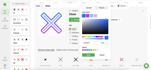
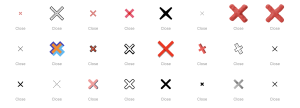
- Shape and Symbolism: Effective close icons are instantly recognizable, typically represented by an ‘X’ or cross. These simple shapes are universally understood, allowing for quick user interaction.
- Color Theory: The color of the close icon should complement the app’s overall design while standing out enough to be immediately noticeable. Red, often associated with stopping, is popular but must fit the overall color palette.
- Size and Placement: Proper sizing and strategic placement are crucial. The close icon needs to be easily tappable without overpowering other design elements. Placing it in the upper corners commonly maximizes usability and aligns with user expectations.
Aesthetic Integration
The close icon should not only perform well but also look like an integral part of the app’s design:
- Matching Style with Theme: The icon’s style should reflect the app’s overall aesthetic, whether minimalist or detailed.
- Contrast and Visibility: High contrast between the icon and its background is key for quick identification.
- Seamless User Interface Flow: The icon should facilitate a smooth navigational flow, guiding the user intuitively through app interactions.
Functional Considerations
- Interactive Elements: Adding interaction, like a visual response when tapped, can enhance user experience by confirming actions visually.
- Usability: The icon should be easy to find and use, with a consistent placement that users can rely on.
- Accessibility: Design should consider all users, including those with disabilities, featuring ample size and contrast for easy interaction.
Innovative Design Techniques
- Using Animation: Subtle animations can make the interaction with a close icon more engaging and less mechanical.
- Minimalist vs. Detailed Icons: The choice between minimalist and detailed icons should be guided by the overall design language of the app and its target audience.
- Case Studies: Successful apps often feature creatively designed close icons that are both functional and aesthetic, contributing to a cohesive user experience.
User Interaction and Experience
- Impact on User Behavior: A well-designed close icon can streamline navigation, reduce user frustration, and improve overall engagement.
- Intuitive Design for Retention and Satisfaction: An intuitive icon design helps retain users by making interactions simple and stress-free.
- Gathering and Implementing User Feedback: Continuously refining the close icon based on user feedback ensures the app evolves to meet user needs effectively.
Conclusion
The design of close icons is a critical aspect of mobile app development that demands careful consideration and continuous innovation. These icons are not just functional elements but are integral to the aesthetic and usability of an app.
Call to Action
Encourage ongoing experimentation with your close icon designs. Explore new styles, test user reactions, and refine your approach using resources like Icons8 to ensure your close icons are both effective and appealing.