Icons are the visual shorthand of user interfaces, conveying functionality, status, or options in a compact format. Among these, check icons play a crucial role in mobile apps, signaling completion, success, confirmation, or validation. Given their importance, getting their design and implementation right is essential for user experience. In this article, we’ll explore best practices for using check icons in mobile apps with a focus on small screens, offering insights for UI designers.
Understanding the Role of Check Icons
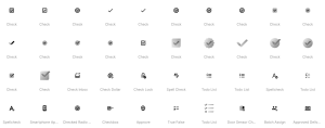
Check icons, often depicted as checkmarks, are versatile elements used in various contexts. They can signal that a task has been completed, a form has been successfully submitted, an item has been selected, or an action has been confirmed. Their ubiquity across mobile apps makes them instantly recognizable to users. This shared understanding allows designers to leverage check icons for intuitive UI design.
Key Considerations for Designing Check Icons
When designing check icons for mobile apps, there are several factors to consider to ensure they are effective and accessible. Let’s delve into some of the key considerations.
1. Clarity and Simplicity
Given the limited real estate on mobile screens, check icons should be clear and simple. Avoid overly complex designs or intricate details that may not be visible on smaller screens. Stick to well-known styles, such as the classic checkmark, to ensure users instantly recognize the icon’s meaning.
2. Size and Scalability
The size of check icons must be appropriate for mobile screens, ensuring they are legible without overpowering other UI elements. A check icon that is too large can disrupt the layout, while one that is too small may go unnoticed. Aim for a size that balances visibility with unobtrusiveness, and consider how it scales across different screen sizes and resolutions.
3. Color and Contrast
The color of check icons should stand out against their background, ensuring high contrast for better visibility. Consider using a color that aligns with your app’s branding while maintaining accessibility standards. Green is a common choice for check icons due to its association with success and completion, but ensure it contrasts sufficiently with other UI elements.
4. Accessibility and Inclusivity
Accessibility should be at the forefront of your design decisions. Ensure your check icons are perceivable by users with visual impairments, including those with color blindness or low vision. This might involve providing alternative text or using patterns to distinguish the icon’s meaning. Test your designs with accessibility tools to guarantee inclusivity.
5. Consistent Placement and Context
Consistency in icon placement contributes to a cohesive user experience. Place check icons in expected locations, such as the top-right corner for completed tasks or beside selected items in a list. The context in which check icons appear should align with user expectations. For example, use them to confirm selections in multi-choice questions or to indicate a successful form submission.
6. Feedback and Animation
Interactive feedback enhances user experience by providing visual cues for completed actions. Consider using subtle animations or transitions when check icons appear, disappear, or change states. This feedback can confirm user actions and add a touch of dynamism to your app.
Implementing Check Icons in Mobile Apps
Having outlined the key considerations for designing check icons, let’s explore some practical tips for implementing them effectively in mobile apps.
1. Leverage Design Systems
Using a design system helps maintain consistency across your app. Many design systems include predefined icons, including check icons, that are optimized for various scenarios. Adopting a design system ensures uniformity in icon size, color, and placement throughout the app.
2. Optimize for Touch Interaction
Since mobile apps rely on touch interaction, ensure your check icons are large enough to be tapped accurately. Avoid placing them too close to other interactive elements to prevent accidental taps. Additionally, consider the ergonomics of thumb reach when positioning check icons.
3. Provide Contextual Information
To avoid confusion, supplement check icons with additional context where necessary. This could be in the form of descriptive text, tooltips, or additional icons that clarify the check icon’s meaning. Providing context helps users understand the purpose of the check icon in different scenarios.
4. Test with Real Users
User testing is crucial for validating the effectiveness of your check icons. Conduct usability tests to gauge how users interact with your app and whether the check icons are understood as intended. Use feedback to make adjustments to size, color, or placement as needed.
5. Monitor User Feedback
Once your app is live, continue monitoring user feedback for insights into how check icons are perceived and used. Look for patterns in user behavior that suggest potential improvements, such as confusion about the icon’s meaning or difficulty interacting with it. Be prepared to iterate on your design based on real-world usage.
6. Stay Updated with Industry Trends
The design landscape is constantly evolving, with new trends and technologies emerging regularly. Stay updated with the latest UI design trends and best practices to ensure your app remains current. This might involve exploring new animation techniques, accessibility features, or user interaction patterns.
Conclusion
Check icons are a fundamental component of mobile app design, serving as a visual indicator of success, completion, or confirmation. By following best practices for clarity, size, color, accessibility, and consistency, UI designers can create check icons that enhance the user experience on small screens. Implementing these icons effectively requires attention to touch interaction, contextual information, user testing, and ongoing feedback. By incorporating these principles, you can create mobile apps that are intuitive, accessible, and engaging, ensuring your check icons communicate their intended message clearly and effectively.